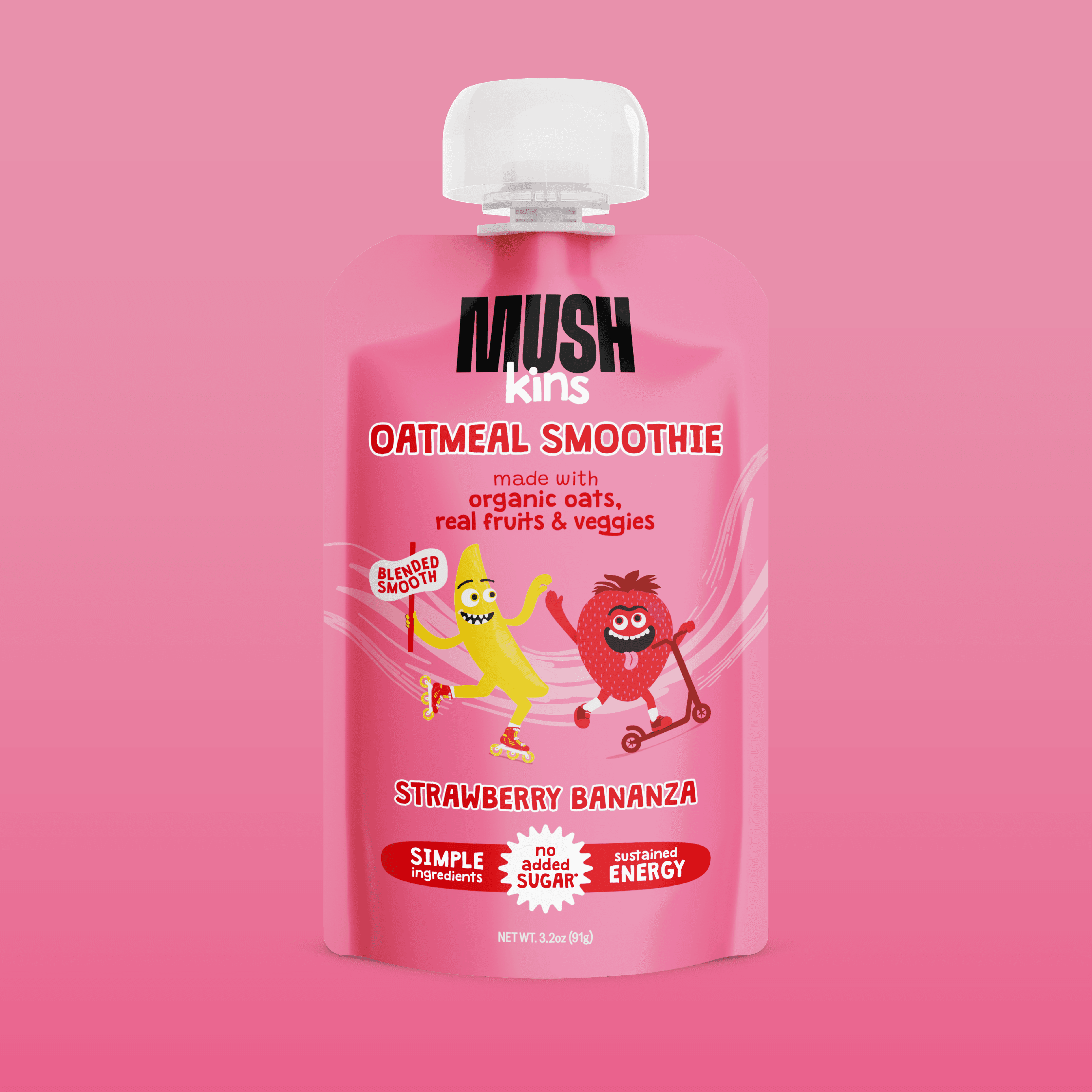
MUSHkins
MUSHkins
Creative direction, identity, packaging, and copy for MUSH's first kids sub-brand. (2024)
Creative direction, identity, packaging, and copy for MUSH's first kids sub-brand. (2024)
CHALLENGE
CHALLENGE
CHALLENGE
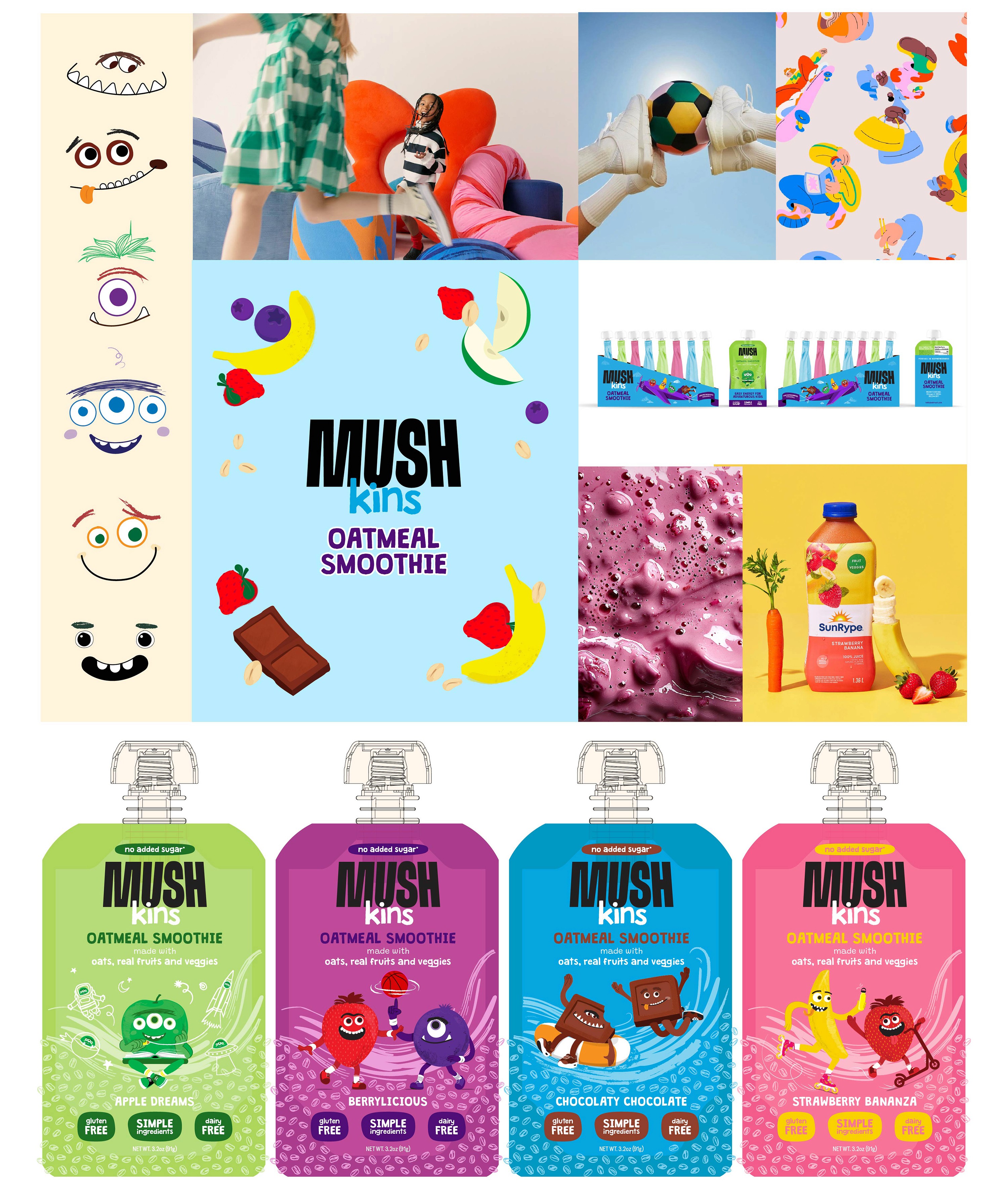
MUSH wanted to extend the brand into a new daypart and a new buyer: kids + the parents who feed them. MUSHkins is an oatmeal smoothie with made whole grains, real fruits & vegetables, and sold in easy-to-eat squeeze pouches. Kids snack packaging usually defaults to cartoon maximalism, which parents distrust. Premium kids brands often look so quiet they lose the kid. MUSHkins needed both at once.
MUSH wanted to extend the brand into a new daypart and a new buyer: kids + the parents who feed them. MUSHkins is an oatmeal smoothie with made whole grains, real fruits & vegetables, and sold in easy-to-eat squeeze pouches. Kids snack packaging usually defaults to cartoon maximalism, which parents distrust. Premium kids brands often look so quiet they lose the kid. MUSHkins needed both at once.
MUSH wanted to extend the brand into a new daypart and a new buyer: kids + the parents who feed them. MUSHkins is an oatmeal smoothie with made whole grains, real fruits & vegetables, and sold in easy-to-eat squeeze pouches. Kids snack packaging usually defaults to cartoon maximalism, which parents distrust. Premium kids brands often look so quiet they lose the kid. MUSHkins needed both at once.
APPROACH
APPROACH
APPROACH
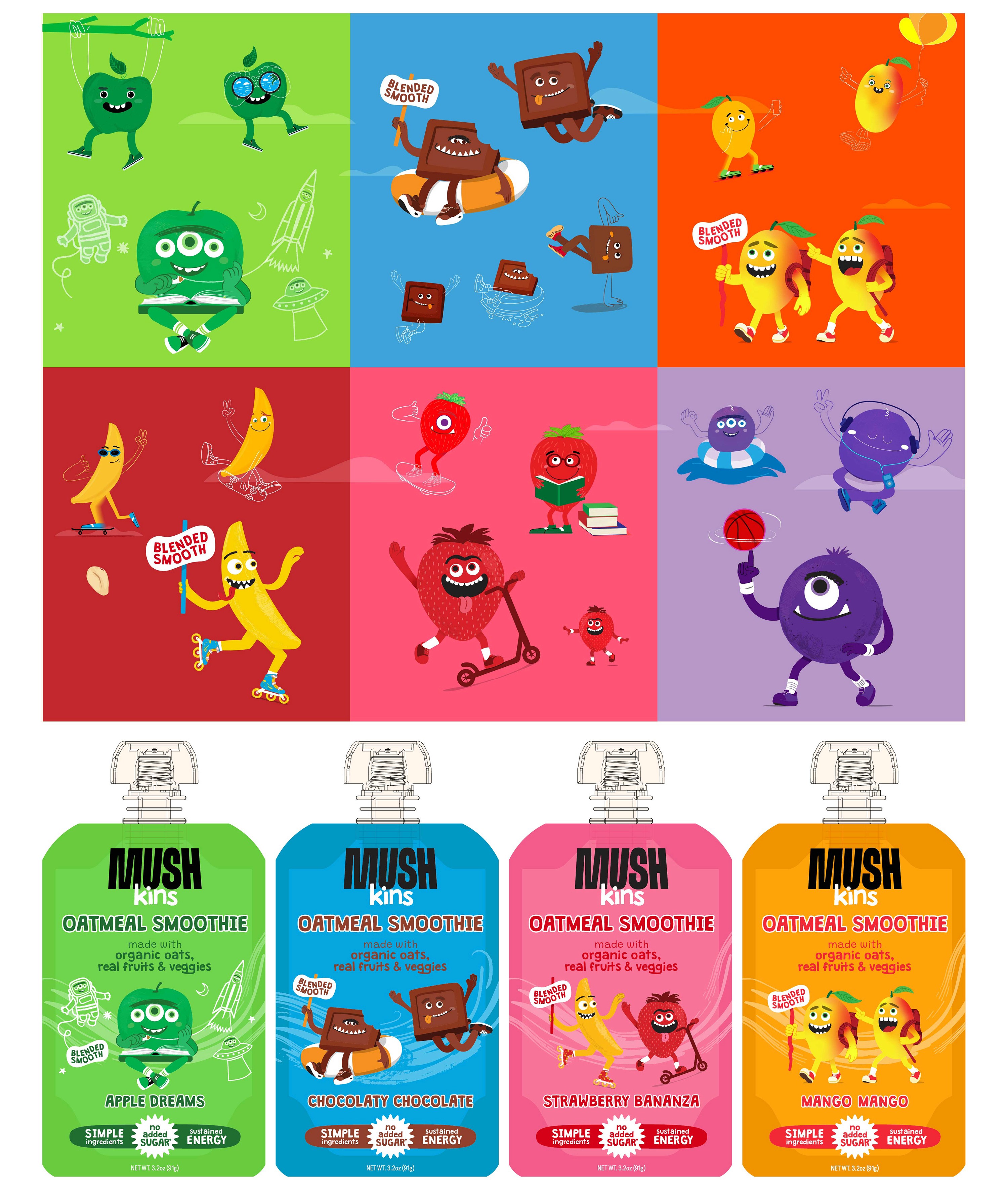
I led the launch end-to-end as the solo designer, building the identity, illustration system, packaging, voice, and copy from scratch. The platform landed on "Easy Energy for Adventurous Kids," positioning MUSHkins as a sidekick to a young explorer rather than a treat. Illustrated vegetable characters carried the warmth. Typography, palette, and grid stayed close to the master brand, doing the work of parental trust.
I led the launch end-to-end as the solo designer, building the identity, illustration system, packaging, voice, and copy from scratch. The platform landed on "Easy Energy for Adventurous Kids," positioning MUSHkins as a sidekick to a young explorer rather than a treat. Illustrated vegetable characters carried the warmth. Typography, palette, and grid stayed close to the master brand, doing the work of parental trust.
I led the launch end-to-end as the solo designer, building the identity, illustration system, packaging, voice, and copy from scratch. The platform landed on "Easy Energy for Adventurous Kids," positioning MUSHkins as a sidekick to a young explorer rather than a treat. Illustrated vegetable characters carried the warmth. Typography, palette, and grid stayed close to the master brand, doing the work of parental trust.
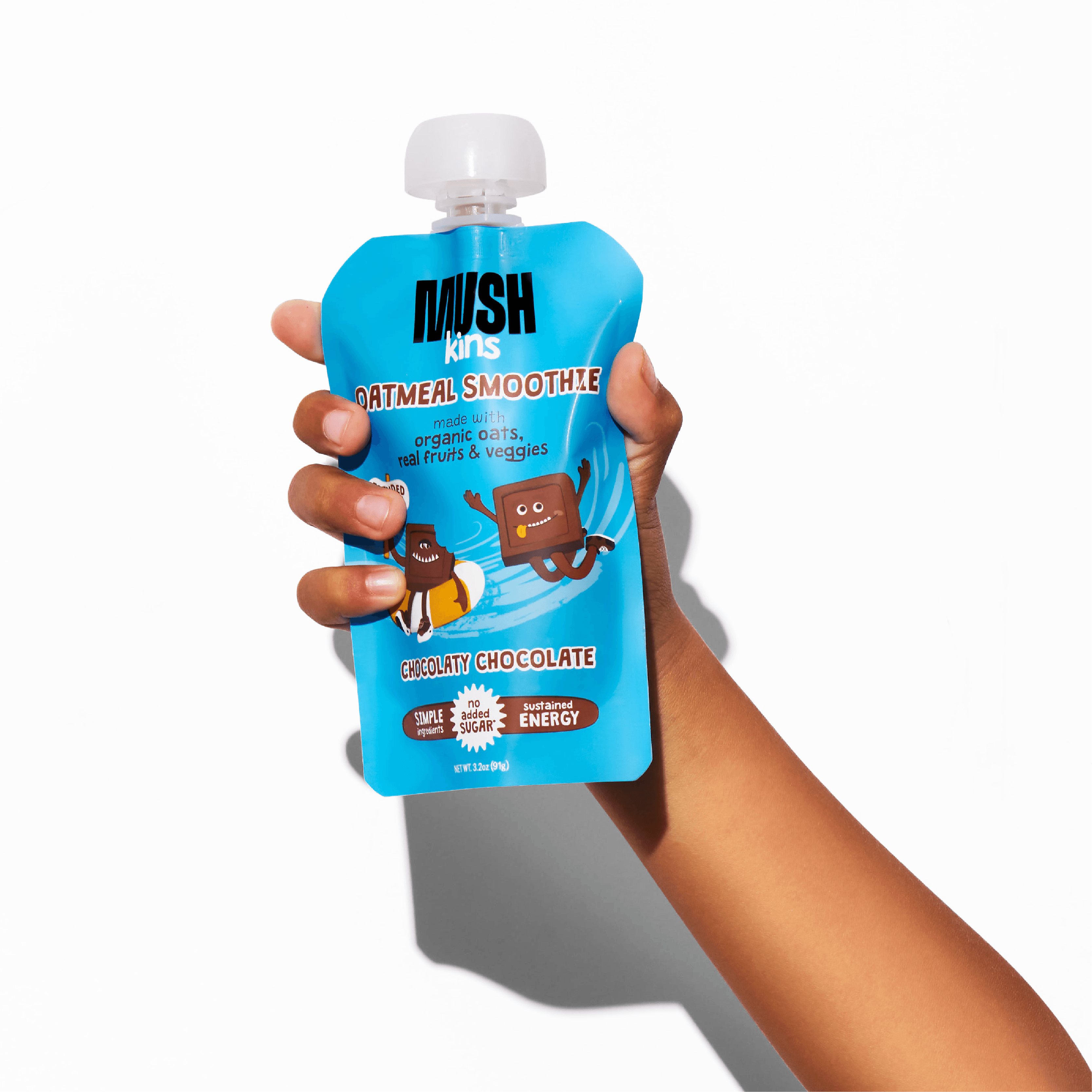
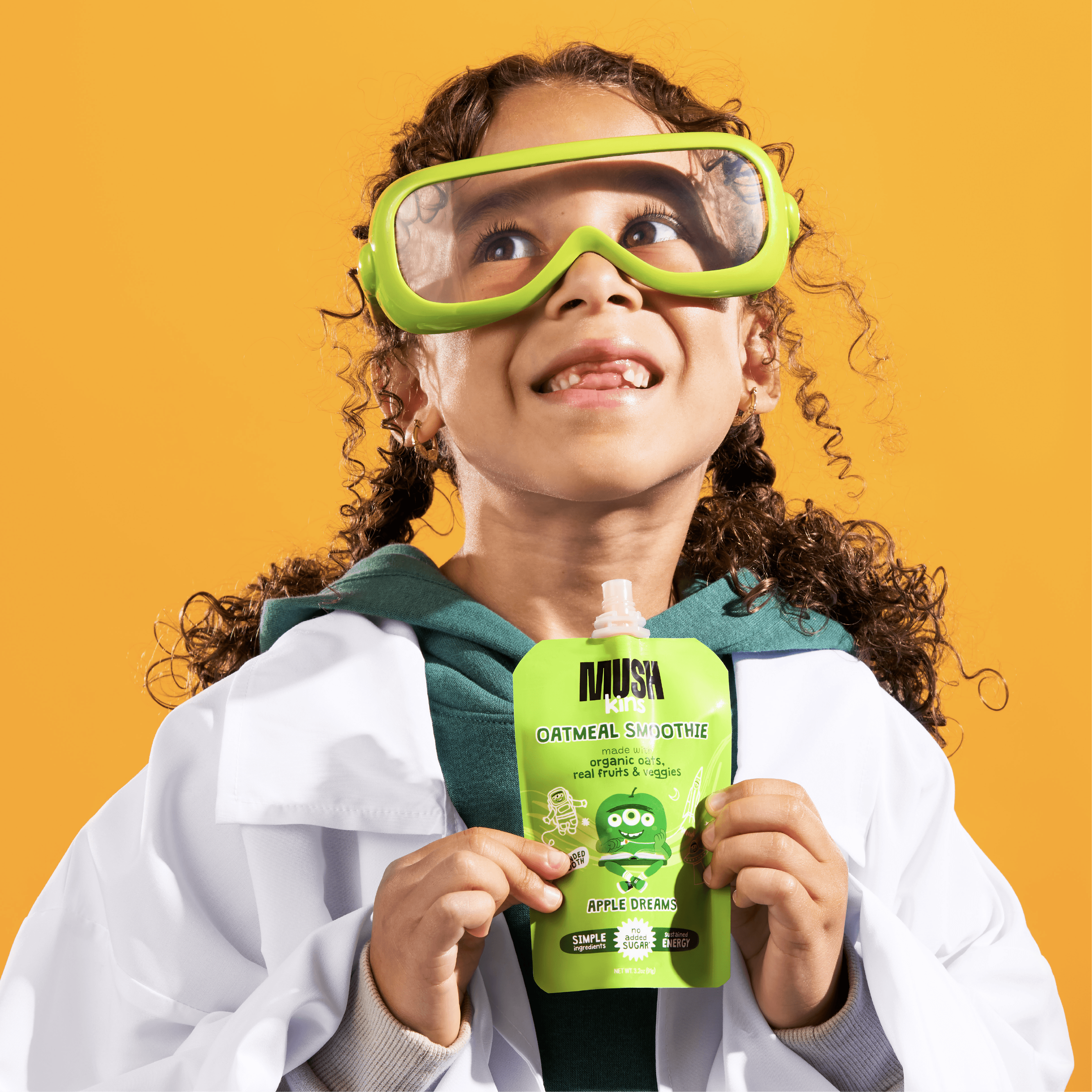


FROM CONCEPT TO POUCH
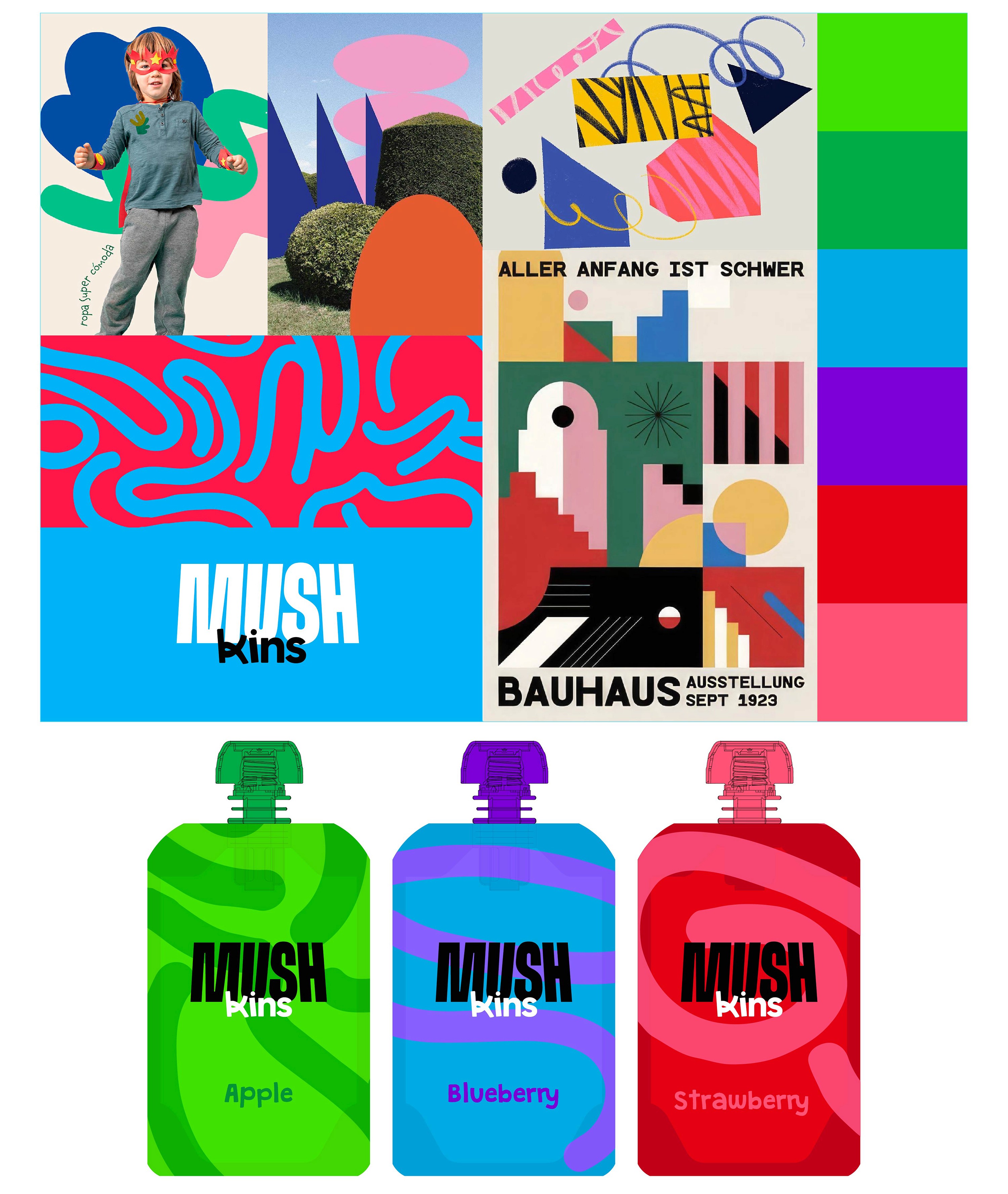
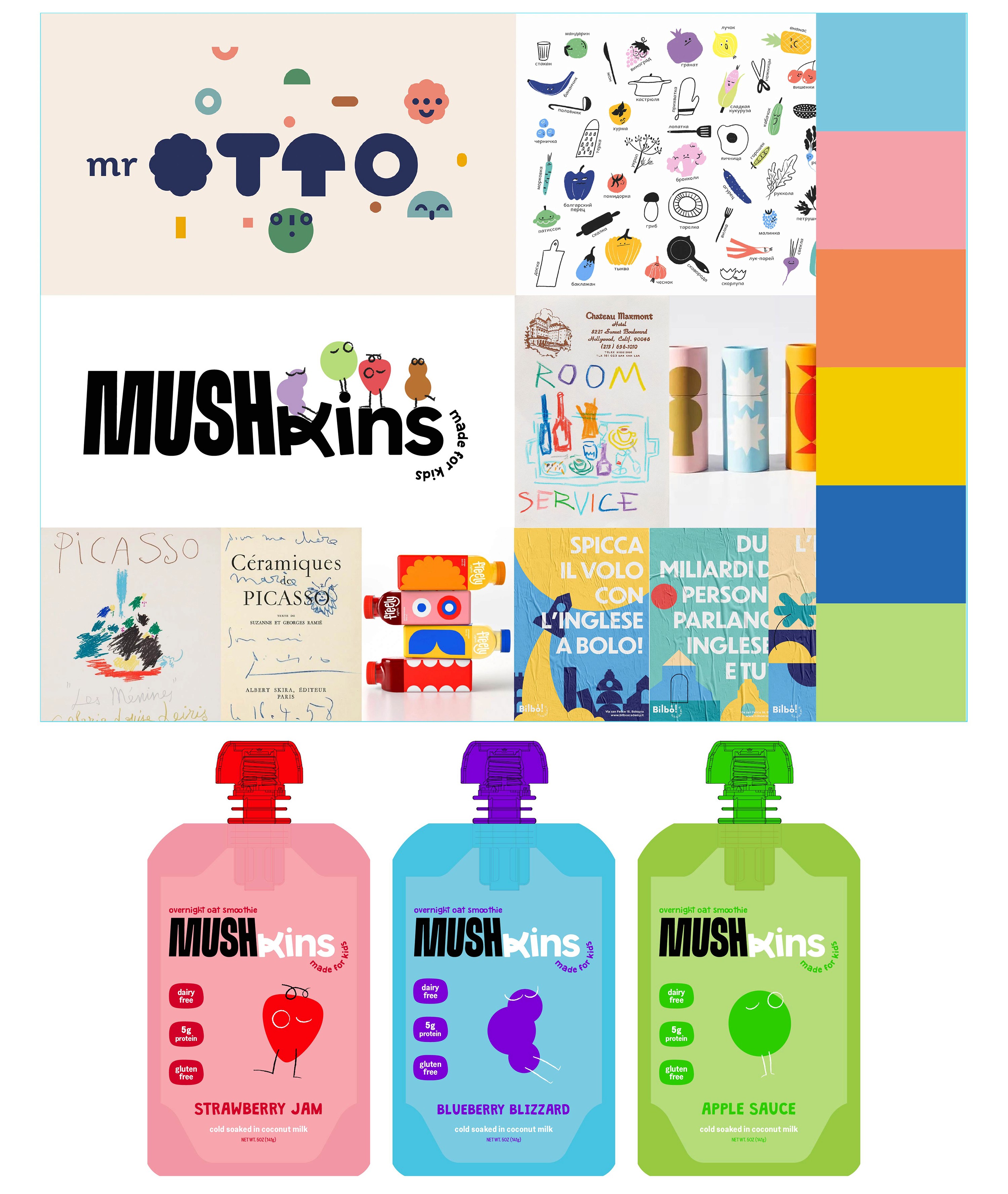
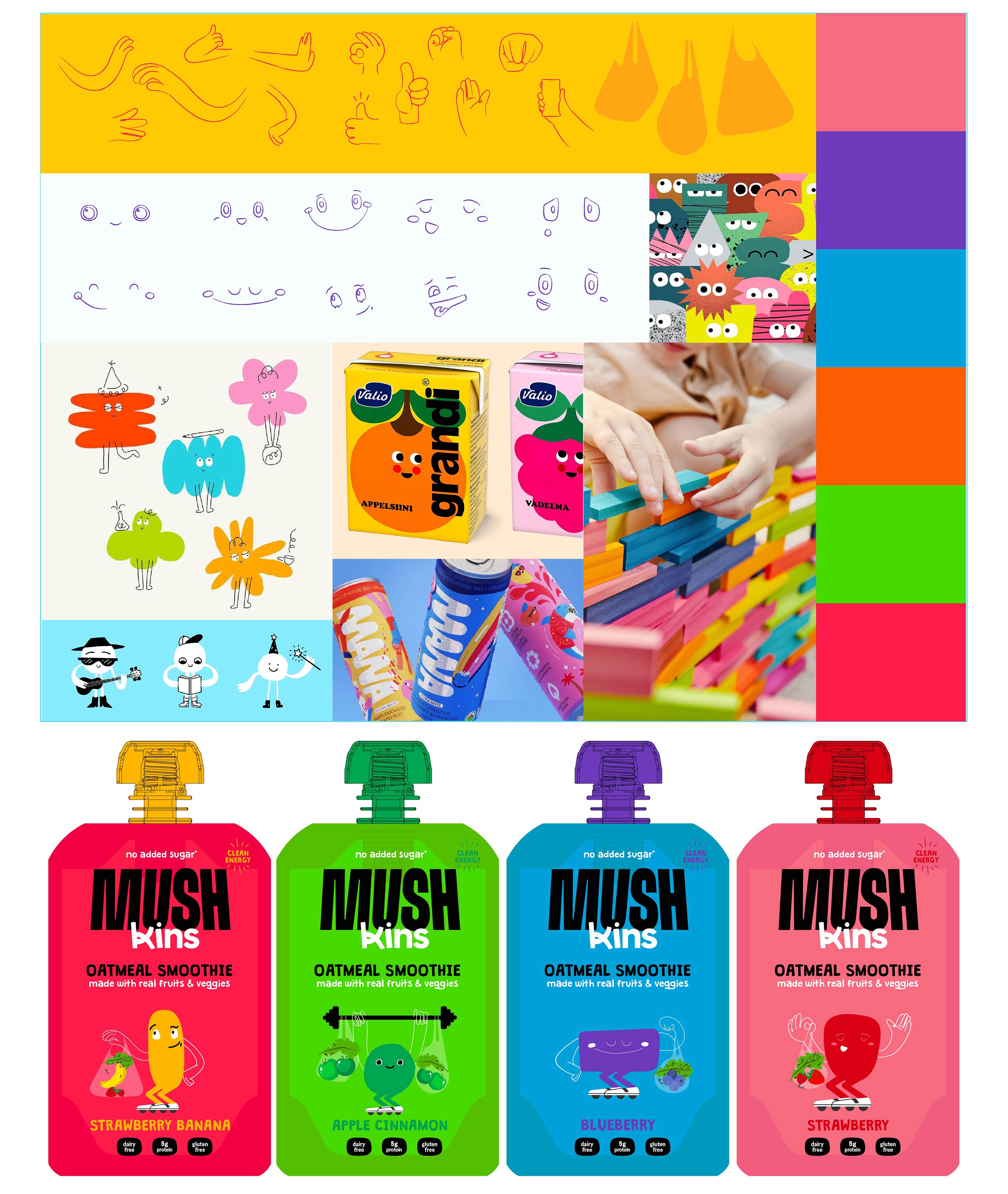
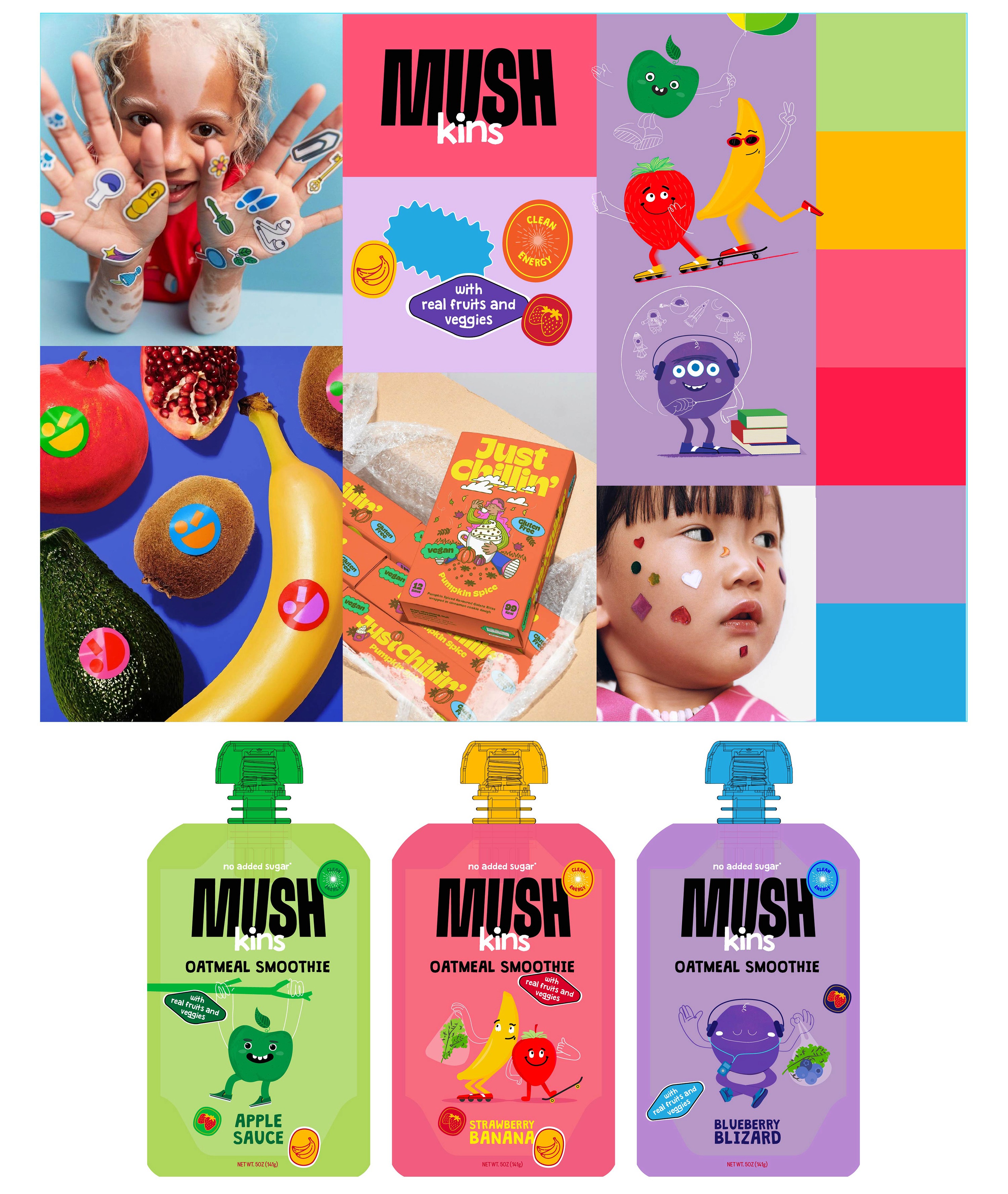
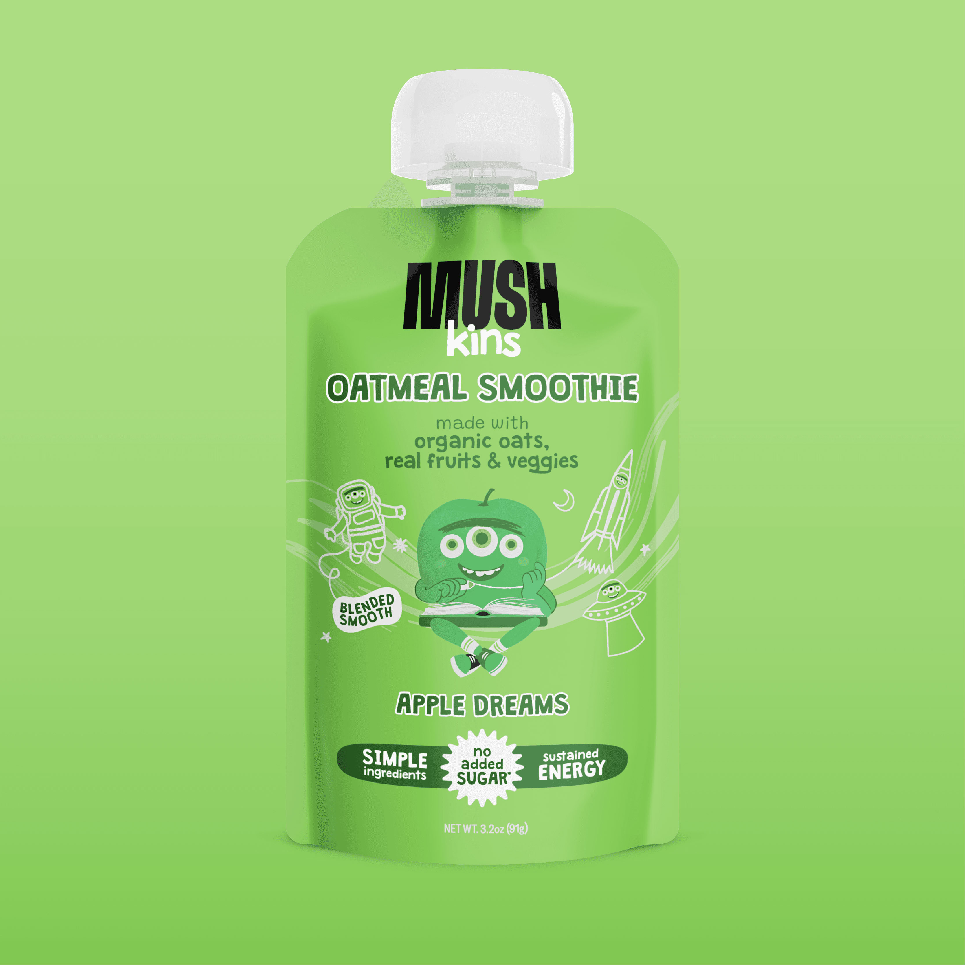
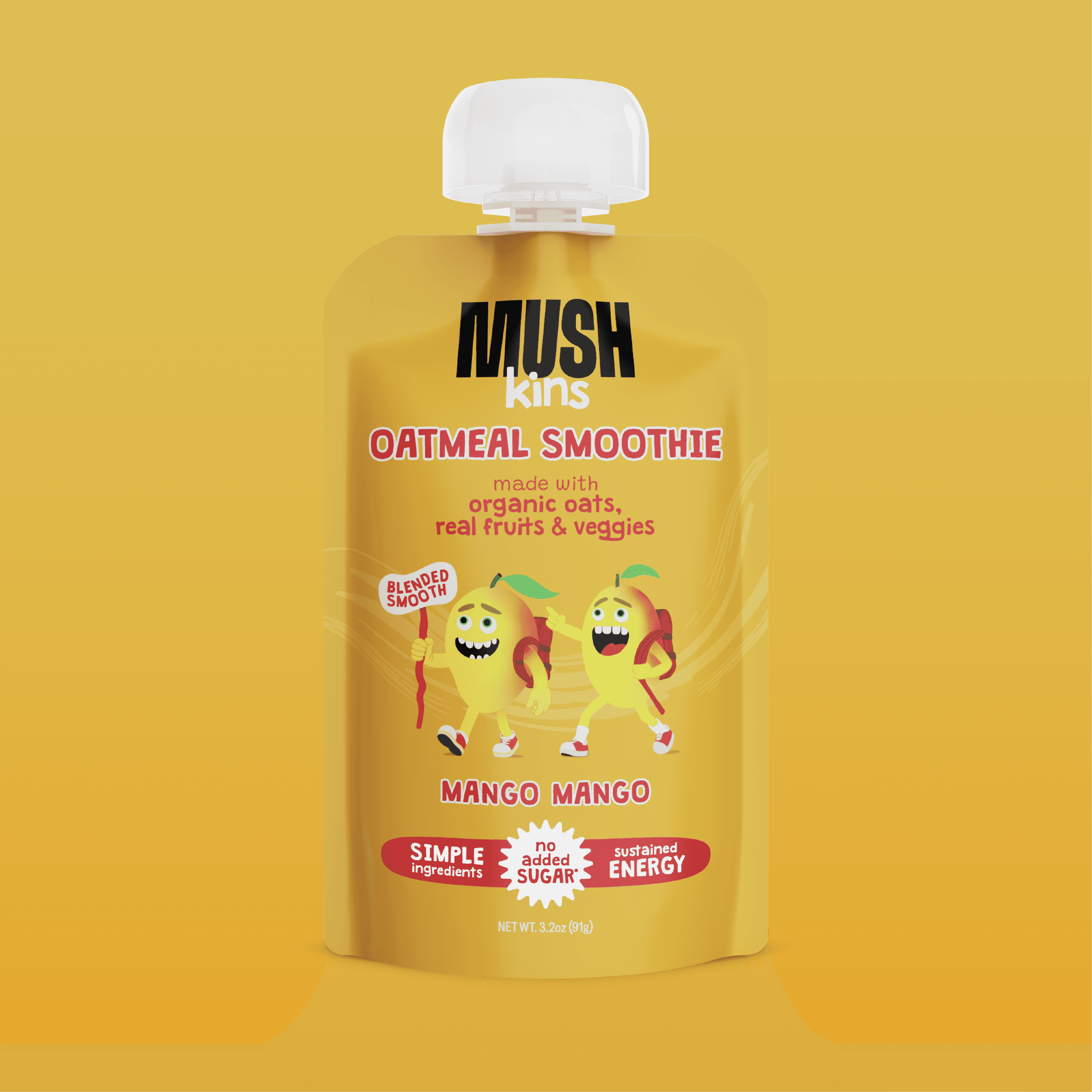
Selected work from a year of building the MUSHkins identity.
FROM CONCEPT TO POUCH
FROM CONCEPT TO POUCH
Selected work from a year of building the MUSHkins identity.
Selected work from a year of building the MUSHkins identity.