MUSH Overnight Oats
MUSH Overnight Oats
Creative direction, identity, and packaging design for the MUSH core brand. (2023–2026)
Creative direction, identity, and packaging design for the MUSH core brand. (2023–2026)

CHALLENGE
CHALLENGE
CHALLENGE
The most telling MUSH feedback came from people who had bought it by accident. Shoppers in the refrigerated set were picking up the cup thinking it was yogurt, getting it home, and being confused by what they found. The original packaging had built the brand and earned the shelf space. But MUSH had outgrown it. The work was to evolve the packaging so it read clearly as overnight oats at shelf, without losing the visual signals customers already recognized.
The most telling MUSH feedback came from people who had bought it by accident. Shoppers in the refrigerated set were picking up the cup thinking it was yogurt, getting it home, and being confused by what they found. The original packaging had built the brand and earned the shelf space. But MUSH had outgrown it. The work was to evolve the packaging so it read clearly as overnight oats at shelf, without losing the visual signals customers already recognized.
The most telling MUSH feedback came from people who had bought it by accident. Shoppers in the refrigerated set were picking up the cup thinking it was yogurt, getting it home, and being confused by what they found. The original packaging had built the brand and earned the shelf space. But MUSH had outgrown it. The work was to evolve the packaging so it read clearly as overnight oats at shelf, without losing the visual signals customers already recognized.
APPROACH
APPROACH
APPROACH
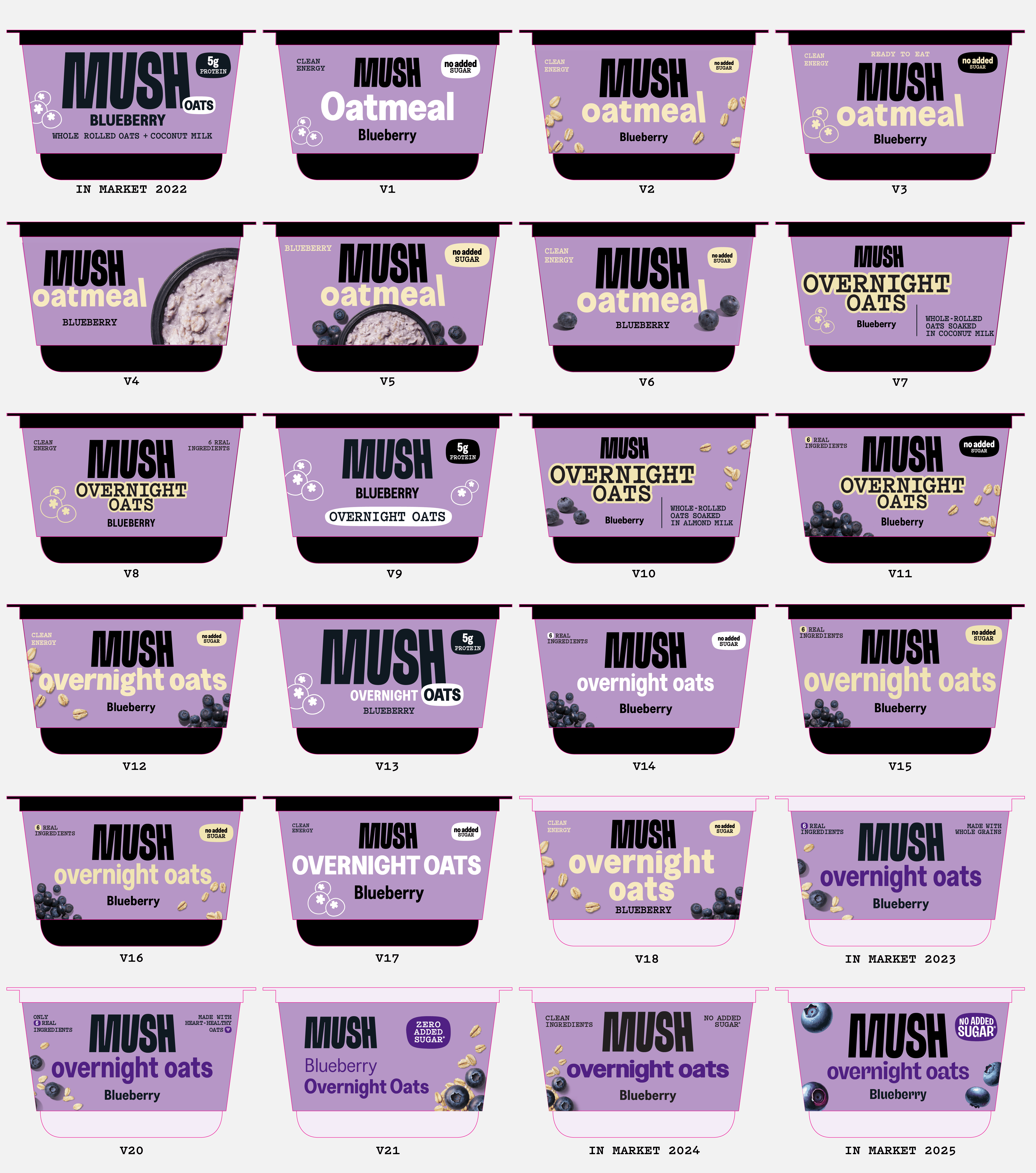
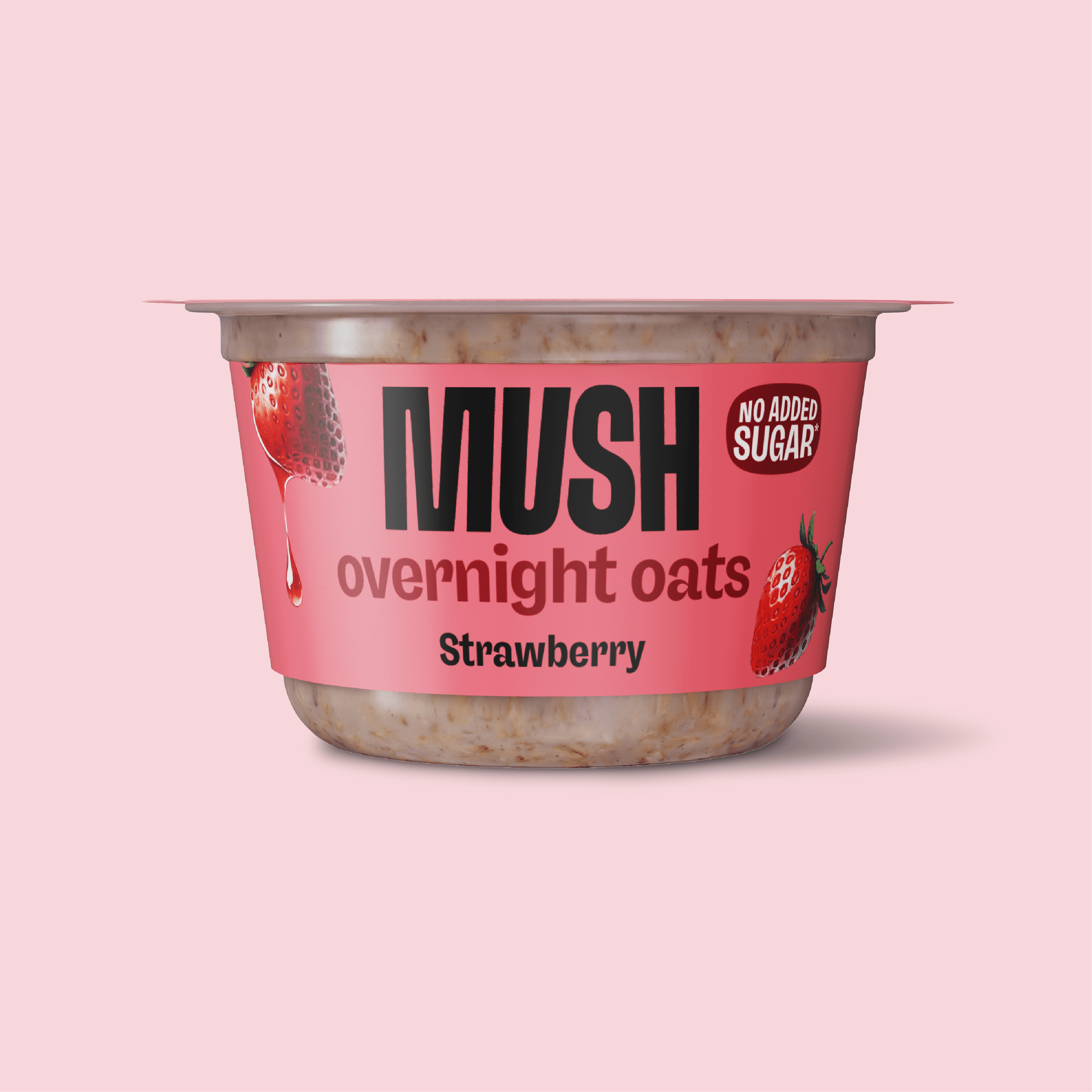
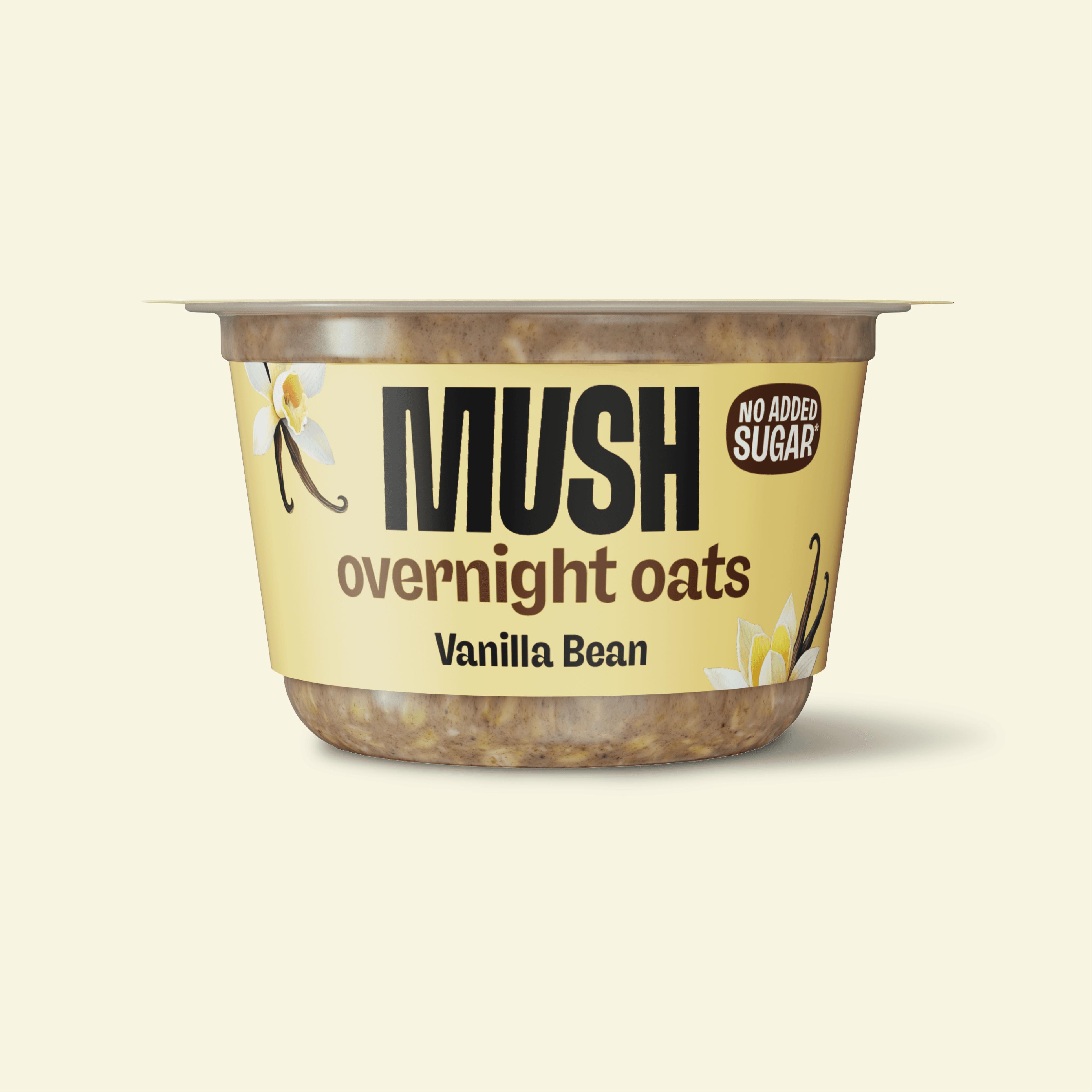
As MUSH's in-house design lead, I lived with the brand at shelf and adapted the work in real time as we got closer to our core consumer. The packaging evolved in stages: flavor iconography for shelf recognition, a transparent cup so the oats were visible through the packaging, "OVERNIGHT OATS" as a statement ID under the logo, and bigger health claims and flavor illustrations as the brand grew up. Each move closed the gap between what MUSH was and what consumers thought it was.
As MUSH's in-house design lead, I lived with the brand at shelf and adapted the work in real time as we got closer to our core consumer. The packaging evolved in stages: flavor iconography for shelf recognition, a transparent cup so the oats were visible through the packaging, "OVERNIGHT OATS" as a statement ID under the logo, and bigger health claims and flavor illustrations as the brand grew up. Each move closed the gap between what MUSH was and what consumers thought it was.
As MUSH's in-house design lead, I lived with the brand at shelf and adapted the work in real time as we got closer to our core consumer. The packaging evolved in stages: flavor iconography for shelf recognition, a transparent cup so the oats were visible through the packaging, "OVERNIGHT OATS" as a statement ID under the logo, and bigger health claims and flavor illustrations as the brand grew up. Each move closed the gap between what MUSH was and what consumers thought it was.

OUTPUT
OUTPUT
OUTPUT
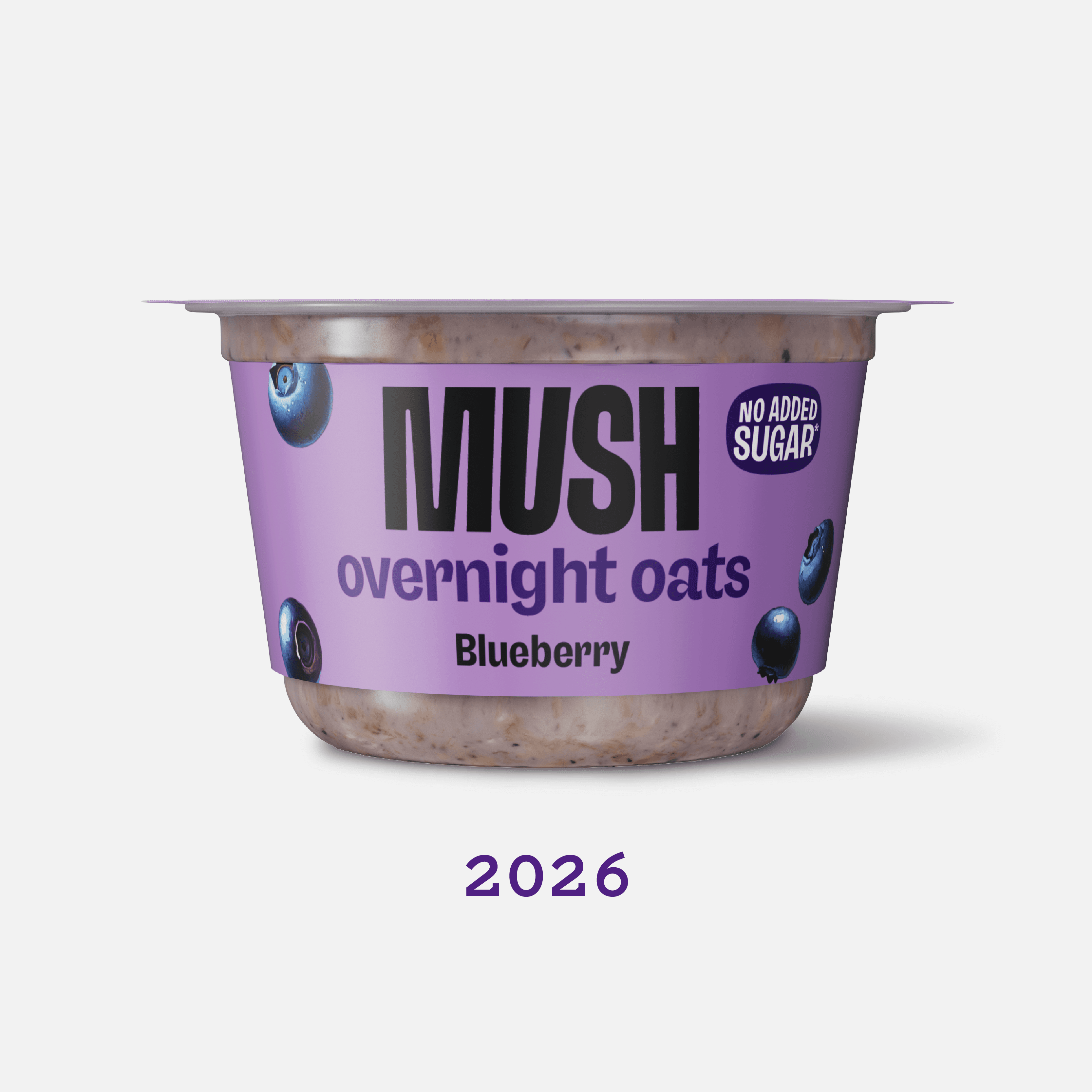
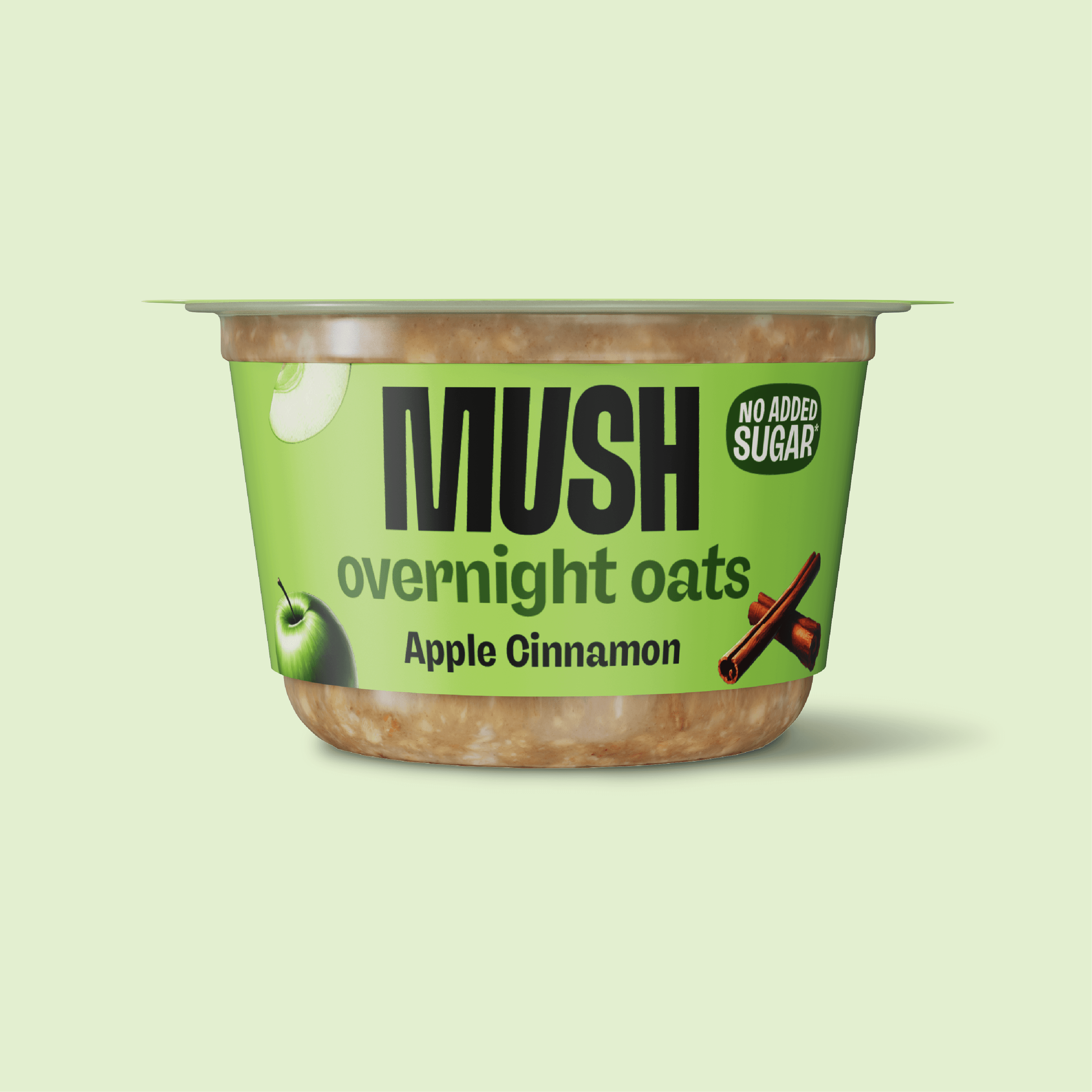
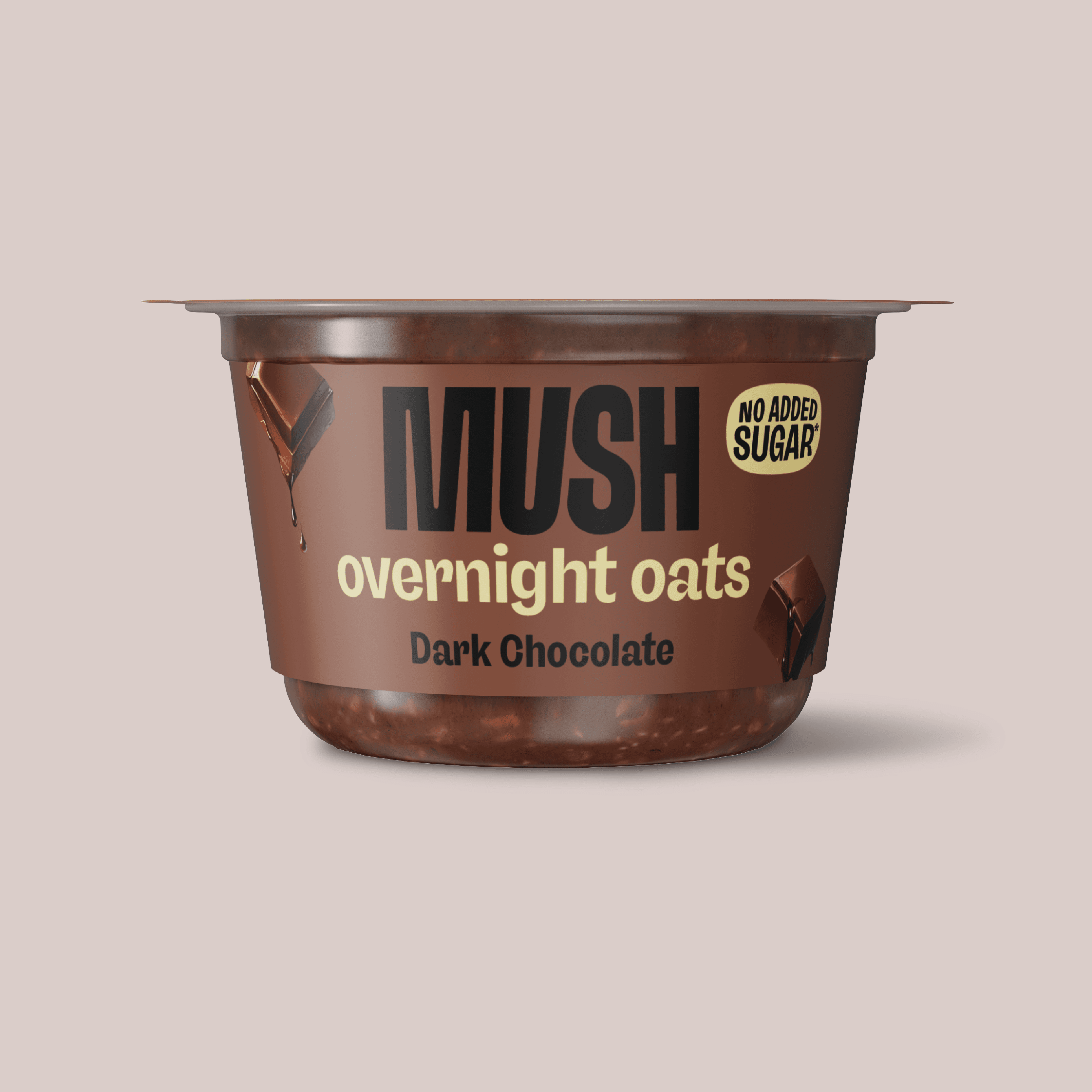
Each round built on the last instead of starting over. That discipline gave MUSH a packaging system the rest of the brand could grow on top of. MUSH Protein, MUSHkins, and brand partnerships all sit on this foundation.
Each round built on the last instead of starting over. That discipline gave MUSH a packaging system the rest of the brand could grow on top of. MUSH Protein, MUSHkins, and brand partnerships all sit on this foundation.
Each round built on the last instead of starting over. That discipline gave MUSH a packaging system the rest of the brand could grow on top of. MUSH Protein, MUSHkins, and brand partnerships all sit on this foundation.
CREDITS
CREDITS
Design Support: Kara DeVol
Renders: Pedro Montalvo
Photography: Breakfast for Dinner
Design Support: Kara DeVol
Renders: Pedro Montalvo
Photography: Breakfast for Dinner
Design Support: Kara DeVol
Renders: Pedro Montalvo
Photography: Breakfast for Dinner